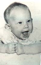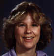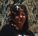
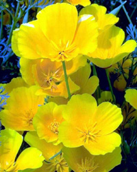
Here are the original images that I started with. All are either scanned from my own photos or in the case of the flower picture it comes from a collection of copyright free collection that I have bought. This collection is put together by BrŘderbund.
 |
|
|||
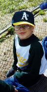
I scanned in pictures of me at different ages from babyhood, 12 grade, and
a year ago, 35 yrs. Boo hoo!!
|
|
|||
 |
|
And here is what all I did:
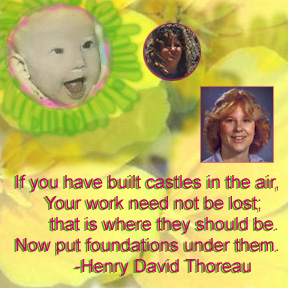
1. I used the Rubber Stamp tool (non-aligned, 50% opacity) to copy one flower out of the original picture. This became the background to my final image. In some places I ran the Rubber Stamp tool over the canvas twice. It gave the background a more blended and sometimes brighter tone. (I experiment A LOT!)
2. I colorized my baby picture using skin, mouth, and hair tones from my sons picture. To accomplish this I used the eyedropper tool. I had to zoom into where I saw hair to get an accurate hair color sample. When I dropped the paint with the Paint Bucket tool I left the opacity at 88%. I also used the dodge, and sponge to fix things here and there the best I could.
3. Once I was colorized, I selected elliptical tool to cut out my face and copy it to the background picture. Once it was there I feathered it 10%.
I suppose I should make a note here that by the time I was done with this image I had six layers to work with. I found (and it was something I believe stated in class) that it was better to put each new thing onto a new layer. If I messed up, it was easy to delete. I also have many saved files from beginning to end to make sure that I could go back and fix things... and to be honest, I know I will still work with this more.
4. Next I bordered the baby picture by using a hot pink color (one of my favorites) and picking the 65 point brush with the wet edges turned on, & 68% opacity. I just painted a little bit. I wanted just enough to set it apart from what I was going to do next.
5. Next I made a custom brush. I made this brush 37 pixels in diameter. I hardened it by 14% (you'd be surprised what a difference it made). I choose a spacing of 65, angle of 0, and roundness of 32%. With this I painted bright green sunrays (or flower petals) around my baby face.
6. Nexted I resized (resampled) my other pictures. First I copied my 12th grade picture into the image I was working on. Of course onto a new layer of its own. This image was very dark. It took a lot of work to get it right, and this is one of the areas where I want to work on it more. Right now it is still too saturated. Anyway, I stroked it to create a pink border. The stroke was one pixel wide. I used the sponge to lighten my hair to the proper likeness, etc.
7. Next, I added 35 yr. old Peggy. She has also been resized and stroked! The stroke on this one was 3 pixels wide and purple in color. I found I could use the eyedropper tool to pick the stroke color. I had to lighten this one up a bit also. I used a gray colored brush to paint away the glare on my sunglasses. The brush was a 45 point brush.
8. Next I added the text. The text is Arial. I did the quote twice; once in green (the same green used in the sunrays) and once in pink (the same colors around my baby face). I used the green for a drop shadow affect.
9. Finally, I flattened the layers and saved this image to a high quality JPEG so that it could be used on the web (and to present to teacher). I still have the original in the default PhotoShop file format so that I can go back and work with the layers when I'm in the mood.
| Here is my final image |
|
Final thoughts: First of all I am excited that I can do this at all. To have come this far in eight weeks is like a miracle to me. Although, I can see many things I'd like to make better for first attempt at all these things I happy. In another attempt I'd like to remember to use more opacity in my pictures and to make them fade (at the edges) into the flowers. Next time I'll spend more time colorizing the baby picture because I can see the mistakes there and if I can, you sure can!
In terms of printing: I printed this out with my little Canon Bubble Jet 210. I was surpised at how good it actually came out. And it looked even better on the photographic paper that I used. All I can say is that I wish I had an HP printer because I don't think the Bubble Jet cuts it anymore. I have grown beyond it's capabilities. One thing I do want to point out however, is that this little printer took my over saturated 12th grade picture and enhanced it even more on the photographic paper. In this print out I have a orange face!!